|
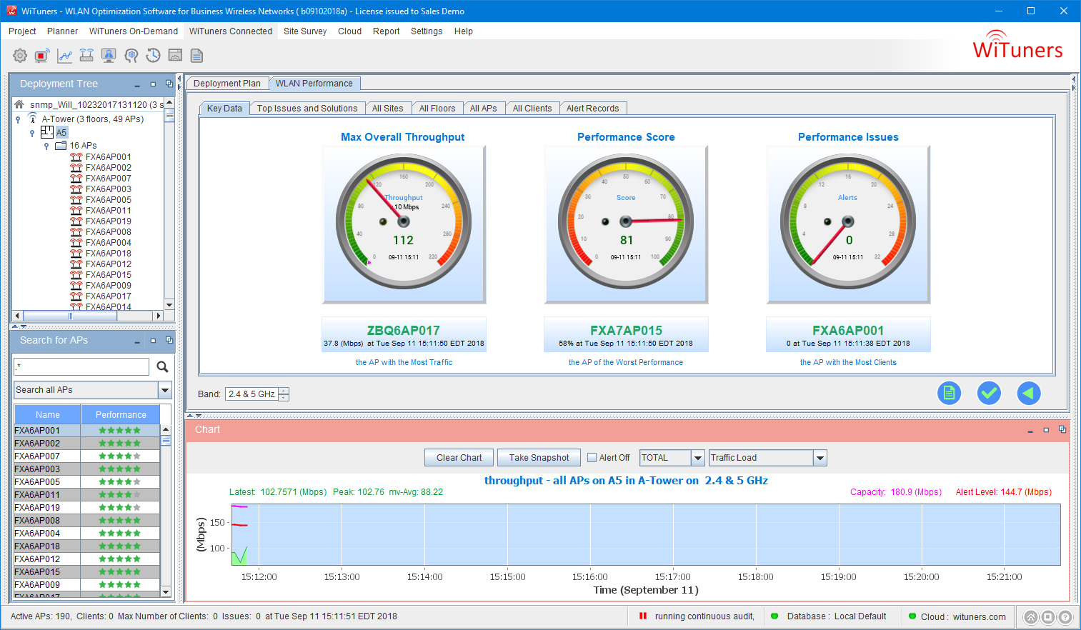
Audit Key Data
The Key Data shows the most important performance data of the WLAN performance. Click on them will take you to tables of more details of the key data of your interest.
At the top of key data are three gauge meters. They allow users to view the most important metrics of the current WLAN performance. The numbers are updated periodically. The pointer and green text show the metrics. The gradient rainbow in green, yellow and red color indicates whether the metrics, or the WLAN performance in turns, are in good states. When the pointer is in the range of green color, for example, the value is within the designed range and the performance is good, while in the yellow color range, it indicates the performance is OK, though not too good. If the pointer is on red color, the metrics is over the predicted WLAN capacities, the WLAN performance is not good and you need to look into details.
Click on a metrics will take you to details of the metrics show the itemized stats, the issues, the root causes of the issues, and the solutions for improvements and fixes.
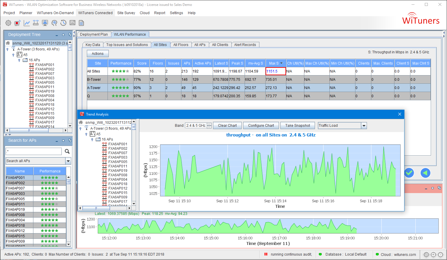
Max Overall Throughput Gauge
It shows the current max throughput for all sites. Clicking on it will show you the throughput chart for all sites in the past day as below. In the meantime, it will take you to the all site table where you will see the details of throughput on each site and the max throughput on all sites is highlighted.
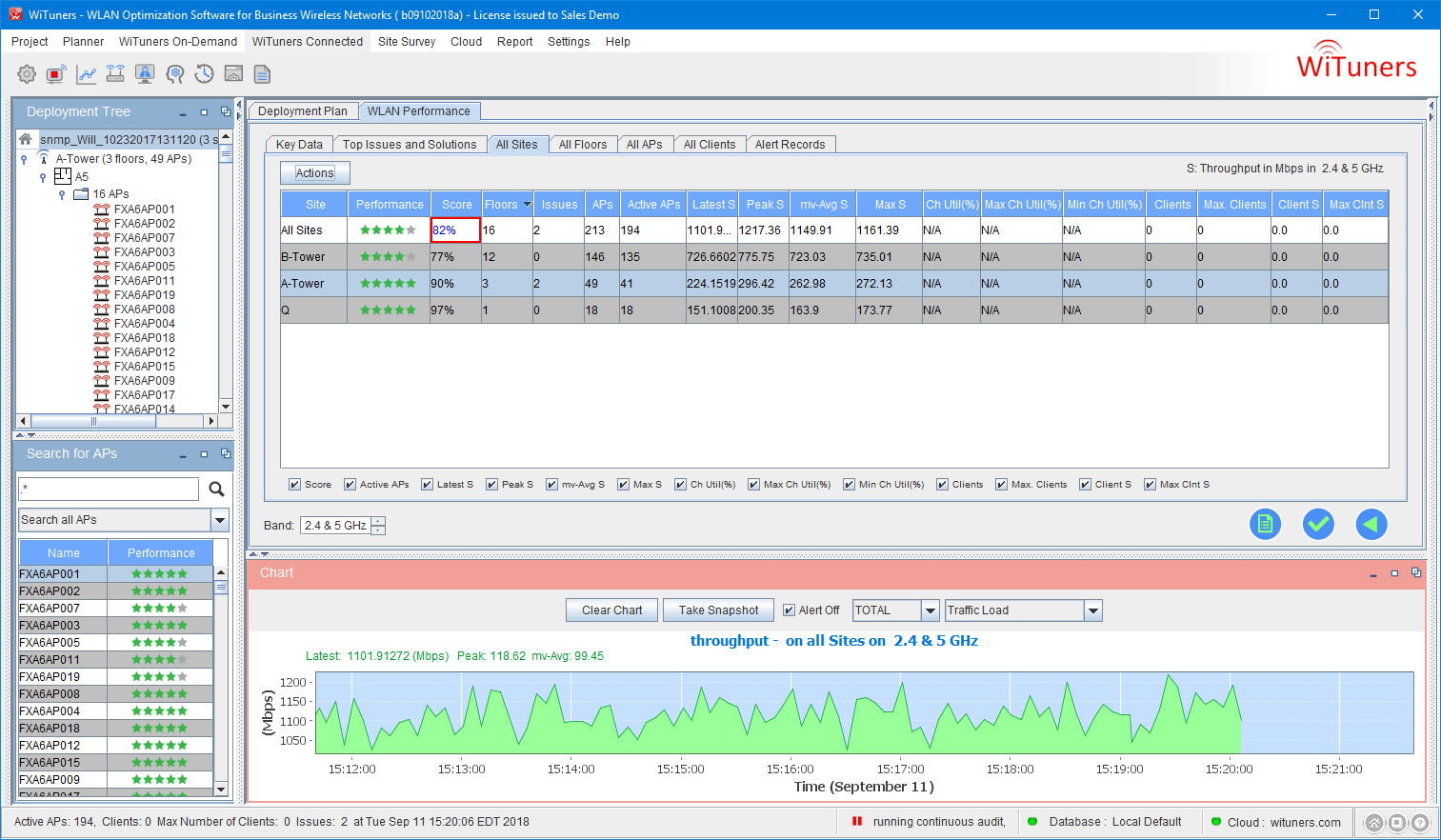
Performance Score Gauge
Performance score gauge shows the current performance score of the WLAN. Many factors including WLAN environment, WLAN deployment plan, real-time WLAN stats of multiple metrics, client stats are taken into consideration of the score. The performance score provides an easy “at-a-glance” visibility into the status or “health” of the Wi-Fi network. Clicking the gauge can lead you to the All Site table with the performance score being highlighted.
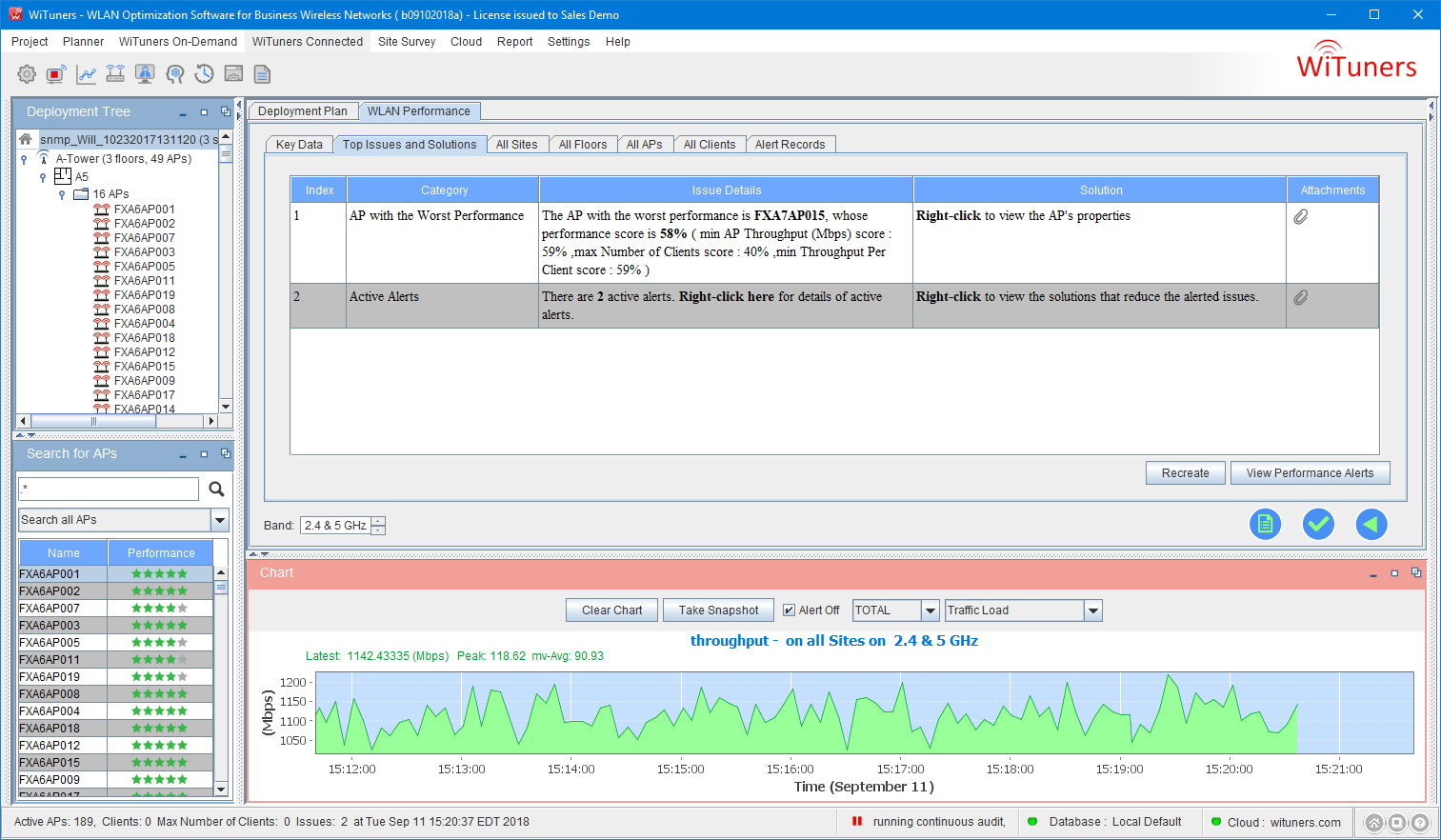
Performance Issues Gauge
This gauge shows the number of active alerts in the WLAN. Click it to view a few issues of top-most importance, as shown below.
The AP with the Most Traffic
This key data tells you which AP in the WLAN has the most traffic, when, and what the maximum throughput value is. Click it to see details about the AP in the AP table as shown below.
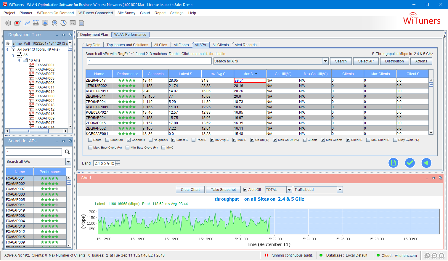
The Aps are sorted by their traffic and the AP with the most traffic is highlighted in the first row of the table. You can look into an AP by selecting a row of AP and click to view further details of the selected AP.
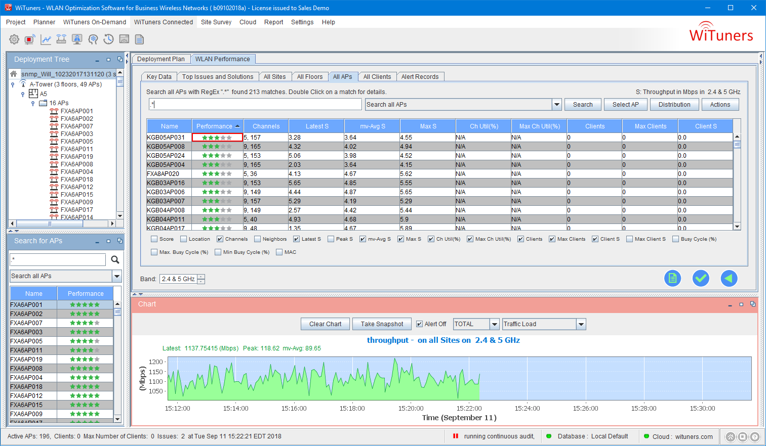
The AP with the Worst Performance
This key data tells you which AP in the WLAN has the worst performance since the start of the audit, when, and what the performance score is. Click on it to go to the AP table where the APs are sorted by their performance scores form the worst to the best and the AP with the worst performance is highlighted. Again, you can look into an AP by selecting a row of AP and click to view further details of the selected AP.
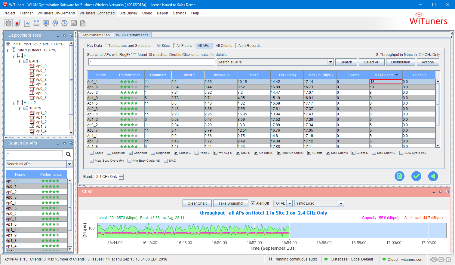
The AP with the Most Clients
This key data tells you which AP in the WLAN has the most number of client devices since the start of the audit, when, and what the number of clients is. Click on it to go the AP table for more details where the APs are sorted by their number of clients and the AP with the most clients is highlighted.
|